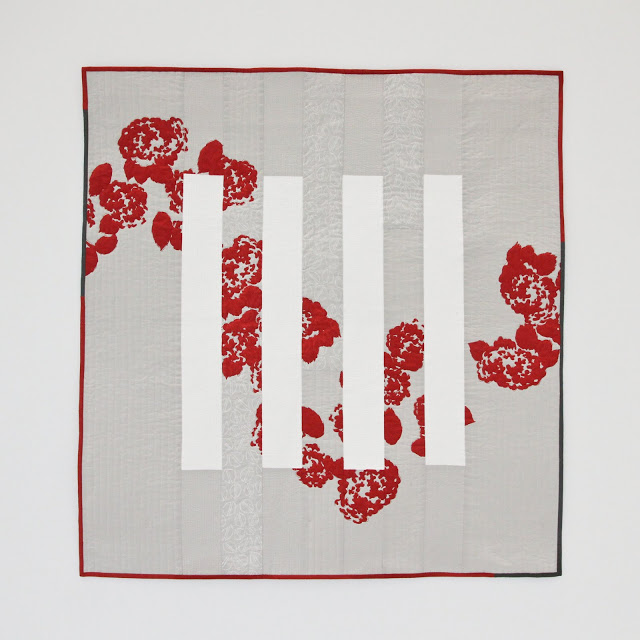
There are simply too many ideas rolling around inside my head to have enough time to quilt them all. QuiltCon was a great opportunity to actually realize one. I have been experimenting with screen printing on quilts for almost two years now, and it was time to scale up. Measuring about 3' x 3', this is my largest printed quilt yet. Big isn't actually all that much slower to piece and sandwich, but quilting it does become a bigger beast.

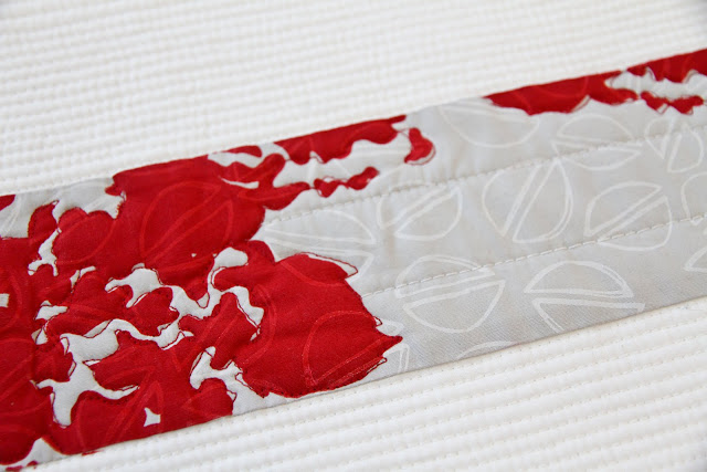
I began with free-motion quilting the blooms one Wednesday. It seemed like the logical place to begin, and then I stalled. I always forget the number of hours I can spend staring at a quilt deciding how to quilt it. Eventually, I decided on matchstick quilting the white bars, but stopped at the edge of the printed blooms.
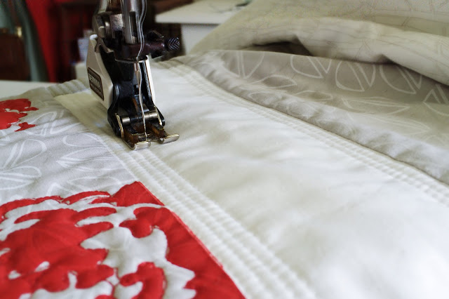

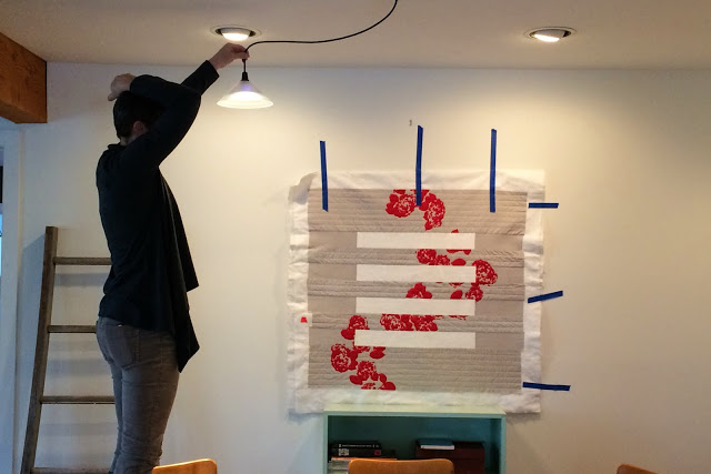
The grey was more difficult. Beginning with 1-inch spaced straight lines, I wasn't happy with the wrinkles and how much the pistachios faded from the design. After several more hours of staring at it taped to the dining room wall over Thanksgiving, I added more quilting to the the solid grey to achieve half-inch spacing.
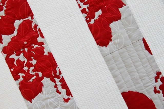
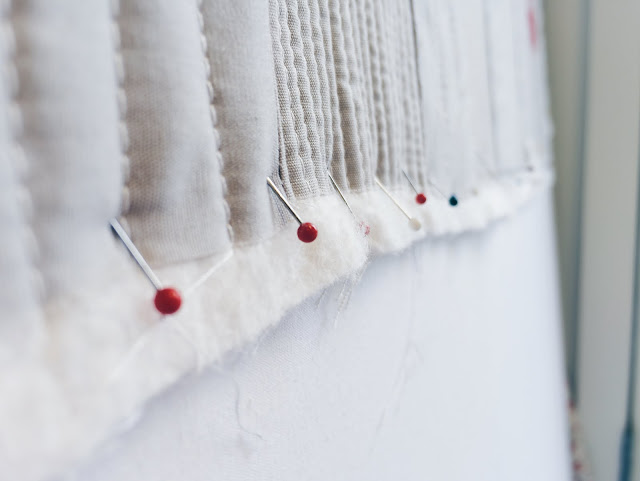
The whole quilt was a little wonky after quilting, so I pinned it to my printing board and blocked it with a spritz bottle and then began the Great Binding Debate. (Did you know that I have had multiple quilts that arrive at this step and never make it further because every binding I audition feels like it will ruin the design? #perfectionistquilterproblems) Eventually, I decided red but with bits of grey. That way red wouldn't touch the red blooms along the edge. I still think light grey could have been zen...or boring...we will never know.
I also can't decide which side I like up. What do you think? Horizontal or vertical bars?
